Released on 6 October 2026, version 2.18 focuses on the virtual station experience: a new interactive time series plot, satellite quicklooks around each station, and a series of improvements that make the map easier to read.
This is the biggest update of the release, and the one you will notice first.
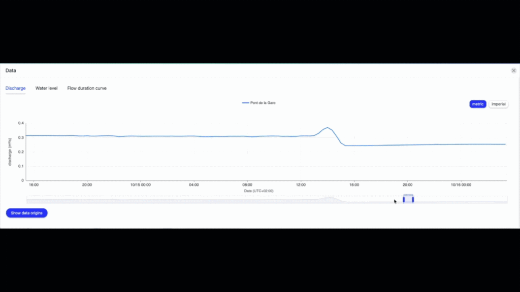
Whenever a virtual station is deployed, you can visualise its hydrograph in the portal. That plot has been rebuilt, and it now comes with a time range slider that lets you select and explore a specific period, including up to 60 days of historic information.
Why this matters: between that history and forecasts running up to 15 days ahead, with a data point every 10 minutes, a single view holds a great deal of information. Until now the detail was there without being easy to reach. You can now zoom into the days that concern you, follow a rising limb hour by hour, or set the week ahead against the same period last month, without losing sight of the whole series.
For anyone managing operational decision, that is the difference between reading a forecast and actually interrogating it.
The new plot applies to water level as well, where it is available. It does not apply to the flow duration curve, which keeps its current display.
A new map type is available in the portal: the Quicklook.
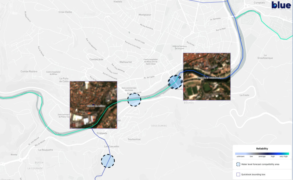
Once a virtual station is deployed, you can display a recent satellite image centred on that station, taken from Sentinel-2, the Earth observation mission of the European Copernicus programme.
A hydrograph tells you what the water is doing. A quicklook shows you where. You see the reach itself, the channel, the surrounding land, and whether the station sits where you expect it to on the river. For teams working on basins they cannot visit easily, or on stretches with no physical gauge nearby, that visual confirmation is worth a great deal.
Details of the image, including its resolution, are available in Data Origins, alongside the other sources behind the station.
Two smaller changes, both of which users will appreciate more the longer they spend in the portal.
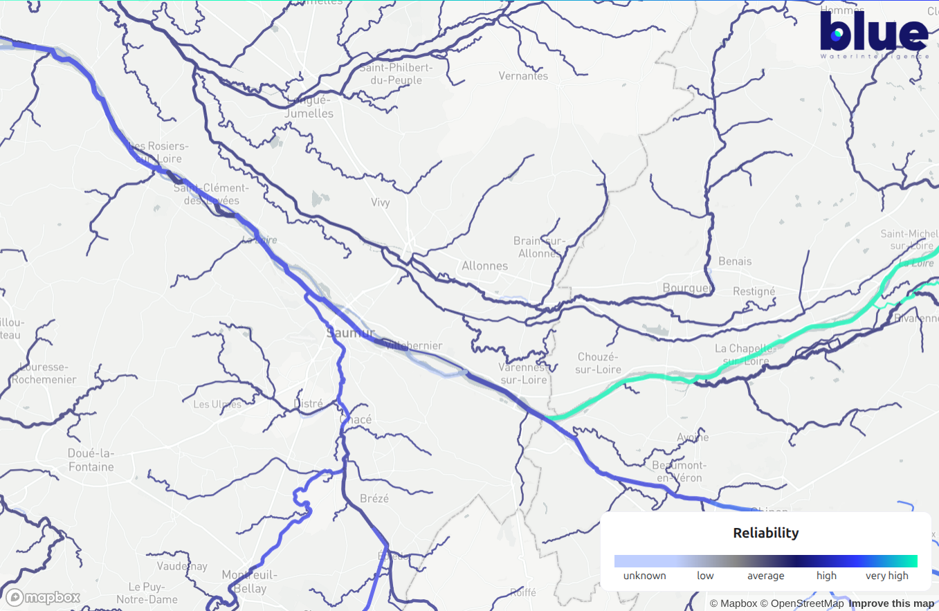
River segments are now sized by Strahler order.
Until now, every branch of the network appeared on the map as a line of the same thickness, whether it was a major river or a small upstream tributary. They are now drawn according to their Strahler order, the standard way of ranking a branch by its position in the network: small headwater streams appear thin, and the lines thicken as the branches join and flow downstream.
The map now looks like the network it represents. You can tell the main river from its tributaries without clicking anything, which makes locating a station, or showing a basin to a colleague, considerably quicker.
Your map settings are now saved. The map type and layers you select are remembered for your next session. A small thing, but it removes a handful of clicks from the start of every working day.

Taken together, these changes make the portal quicker to read at a glance and easier to dig into when the detail matters. Thanks to the whole BWI Downstream team for this release.
👉 Log in to the portal to try it, or get in touch if you would like a demonstration.